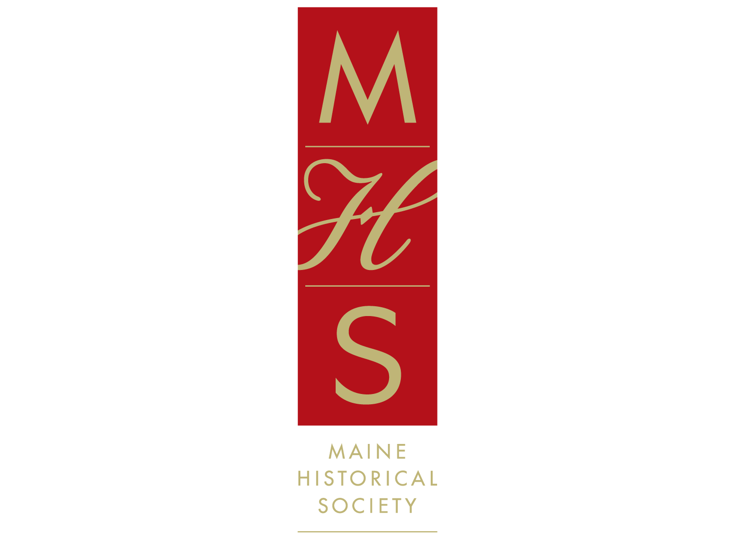
Client:
Maine Historical SocietyDesign/Art Direction:
Janet Friskey · Friskey DesignParticulars:
The “M” and “S” letters, originally from the typeface Futura, were altered to visually harmonize with each other. The “H” was developed from a pencil sketch. Particular care was given to the precise optical spacing of the letters in “Maine Historical Society.”