Client:
Hannaford Bros. Co. (supermarket chain)Design/Art Direction:
Mark Jamra and Neil Patel with Might & MainParticulars:
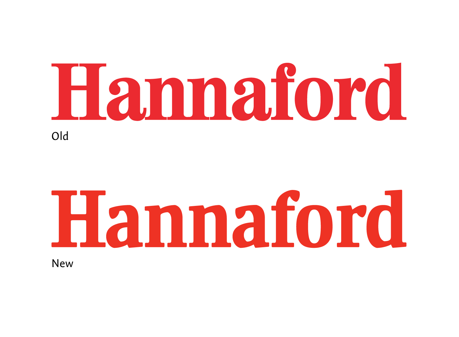
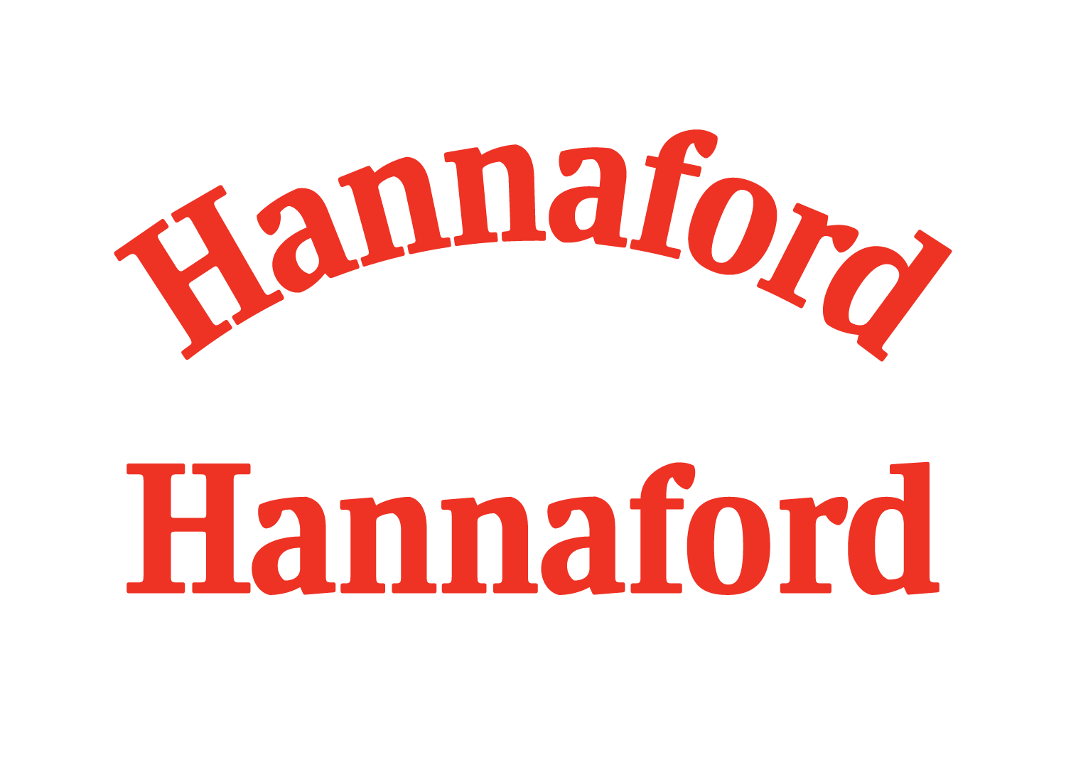
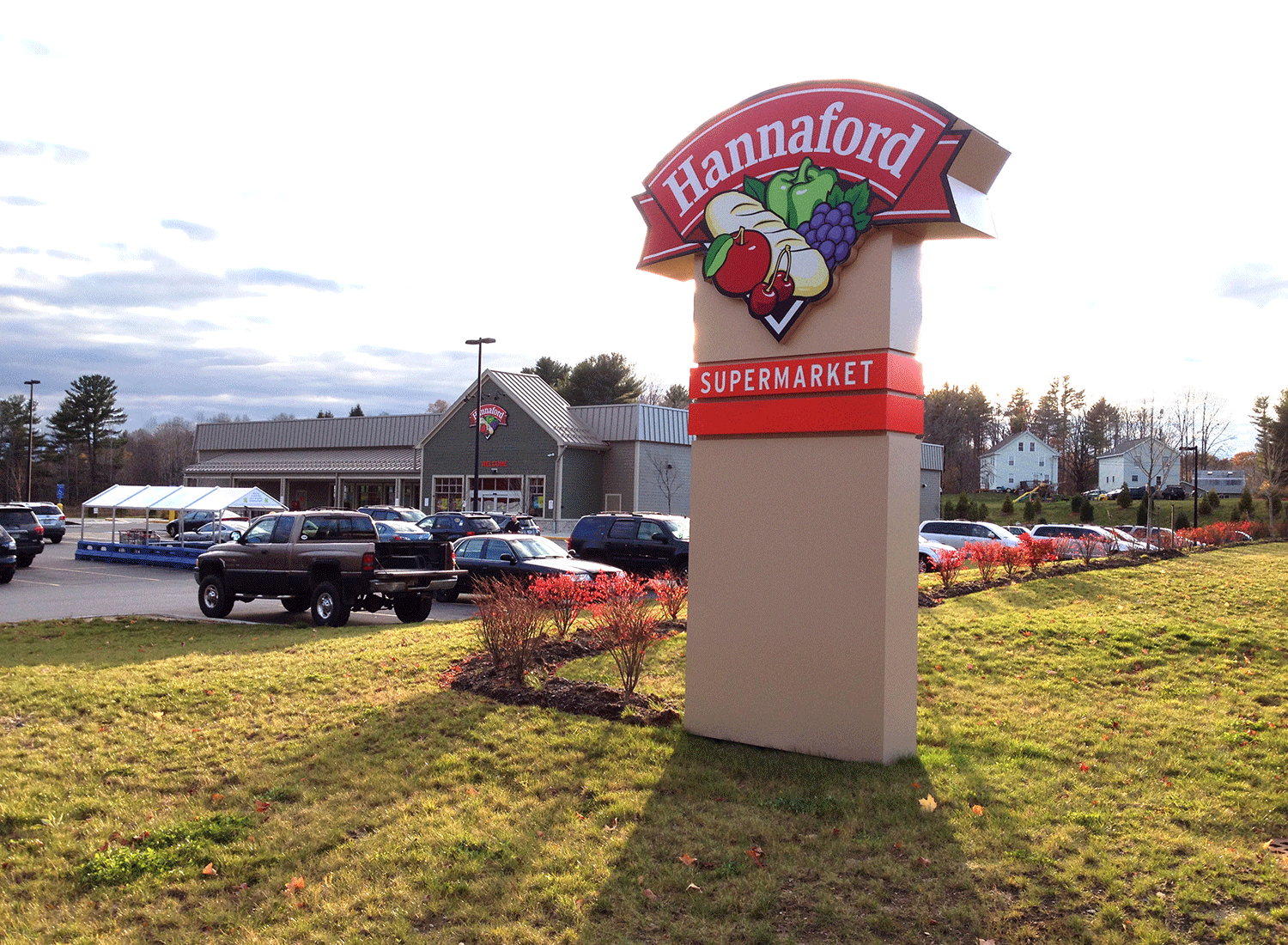
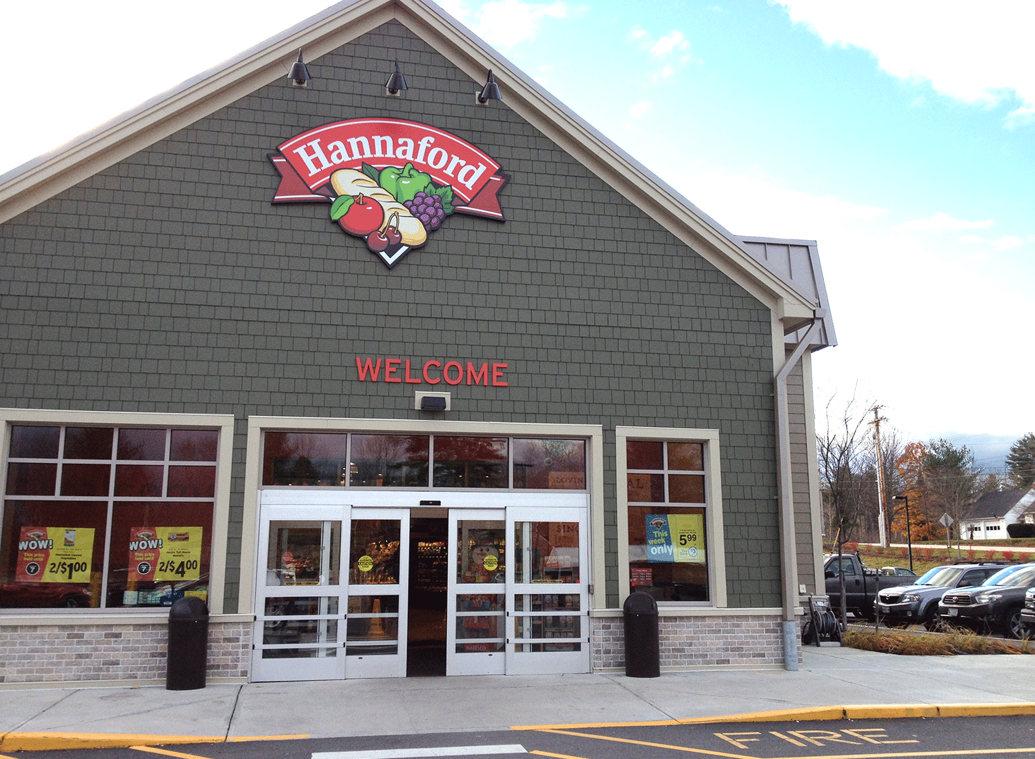
In the strategy for upgrading the branding of Hannaford Supermarkets, the client came to us to replace a manipulated typeface with a custom-designed wordmark. Special attention was devoted to an arced version that, contrary to the previous wordmark, didn’t look distorted or forced. The subtle optical corrections and proportion shifts ensure that the arced letters look completely natural.
